10 Reasons Your Small Business Website Design Isn't Working (And How to Fix It)
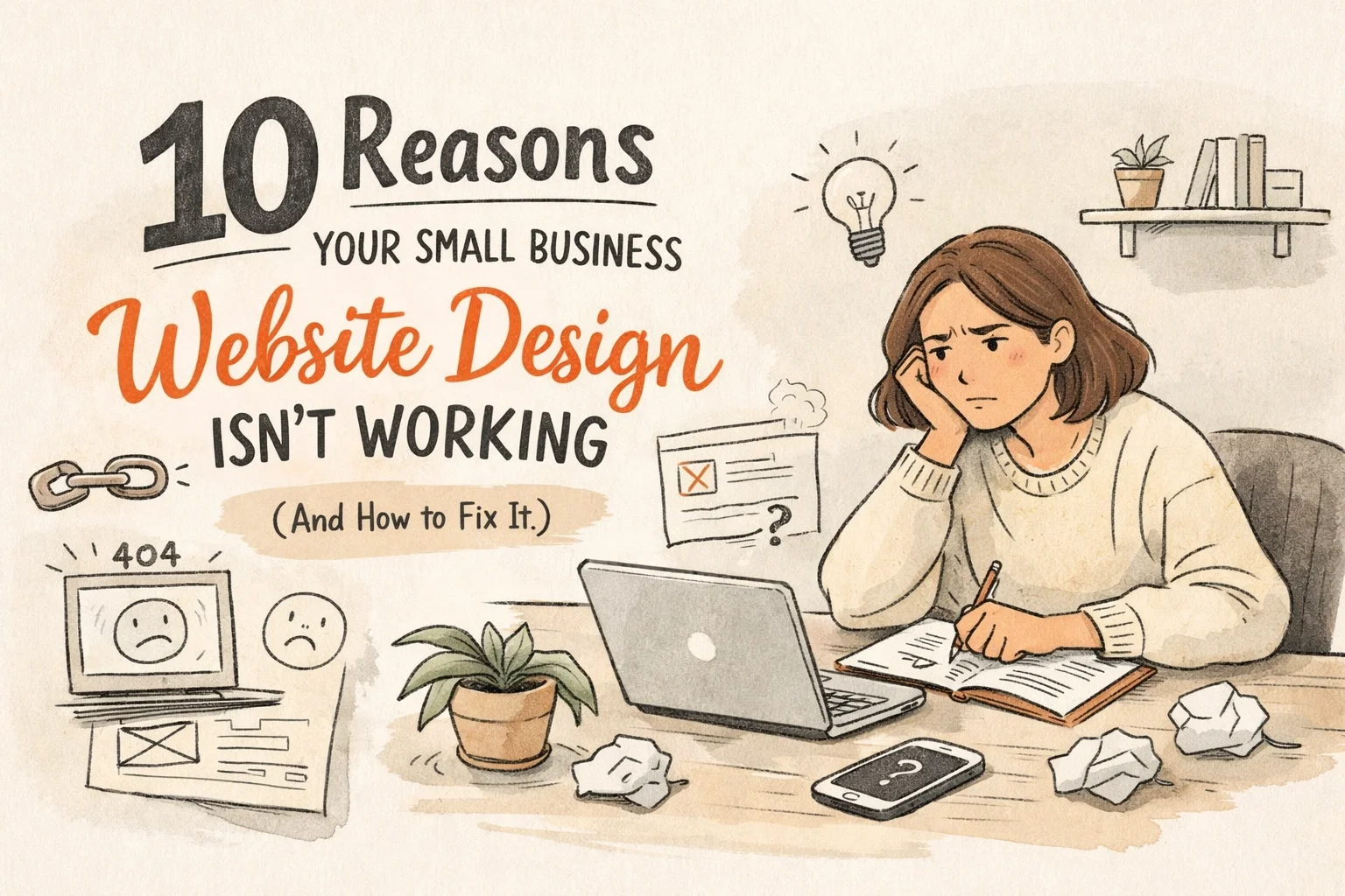
You spent the money. You agonized over the hex codes. You finally hit "publish" and waited for the floodgates to open. But instead of a surge in inquiries, you’re getting the digital equivalent of crickets. Your website is sitting there like a beautiful, expensive paperweight, and honestly? It’s frustrating as hell.
Most small business owners treat a website like a checklist item. "I have a business, therefore I need a URL." But a website isn’t a trophy; it’s a tool. If it’s not converting visitors into clients, it’s broken: no matter how "pretty" it looks.
At Storyteller Wordsmith, we believe strategy precedes execution. If your site is failing, it’s usually because you skipped the strategy and went straight to the paint job.
Here are the 10 reasons your website is currently costing you money instead of making it: and exactly how to fix the mess.
1. You’re Treating It Like a Junk Drawer
We’ve all seen it: the homepage that tries to tell the entire history of the company, list twenty different services, and show off every award won since 2012. Nearly 85% of web designers point to crowded, cluttered designs as the number one mistake small businesses make.
When you give people too many choices, they choose nothing. They get overwhelmed and bounce.
The Fix: Aggressive simplification. Identify the one thing you want people to do when they land on your page. Use white space like you mean it. If a sentence doesn't serve your primary goal, delete it.
2. You’re Shouting Into a Strategy Void
A website without a strategy is just a collection of pixels. If you haven't defined your specific business goals: whether that’s lead generation, direct sales, or booking discovery calls: your design will reflect that confusion.
We see this a lot: business owners who want to be everything to everyone. But as we often say, niching isn’t limiting: it’s liberating.
The Fix: Define your "one thing" before you move another pixel. Who is the audience? What is the message? What is the offer? If those three aren’t aligned, your design will never work.

3. Your Load Speed is a Buzzkill
You have about three seconds. If your site takes longer than that to load, 53% of your visitors are gone. They aren't coming back. They’ve already moved on to a competitor whose site didn’t make them wait like they’re using a dial-up connection in 1998.
The Fix: Optimize your images. Stop uploading 10MB files directly from your iPhone. Use tools like Google PageSpeed Insights to see where the bottlenecks are. Sometimes the cost of fancy development includes heavy code that kills your performance. Keep it lean.
4. You’re Ignoring the Mobile Majority
Over 60% of web traffic is mobile. If your site looks great on your 27-inch iMac but is a nightmare to navigate on a thumb-sized screen, you’re effectively closing your doors to half your potential customers. Google also prioritizes mobile-first sites, so a bad mobile experience is actively killing your SEO.
The Fix: Test your site on an actual phone, not just the "mobile view" in your browser. Are the buttons big enough to tap? Is the text readable without zooming? If not, it’s time for a responsive overhaul.
5. Your Messaging is All "Me, Me, Me."
Your customers don't actually care about you. They care about what you can do for them. If your website is a long monologue about your "passion for excellence" and "years of experience," you’ve already lost them.
Crafting brand stories requires making the customer the hero, not yourself.
The Fix: Flip the script. Every headline should address a pain point or a desired transformation for your client. Use "you" more than "we."
6. Your Navigation is a Scavenger Hunt
If it takes more than five seconds for a visitor to find your contact page or your pricing, they’re going to leave. Confusing navigation and poor information architecture are silent killers. When people feel lost, they feel frustrated, and frustrated people don't buy.
The Fix: Streamline your menu to 5–7 essential items. Use clear, boring labels. "Work With Me" is better than "The Journey." Don't make people think.
7. You’re Too Scared to Ask for the Sale (Weak CTAs)
70% of small business websites lack a clear Call to Action (CTA). You’re basically inviting people into your shop, letting them look around, and then never asking if they need help. "Contact Us" is okay, but it’s weak.
The Fix: Use bold, high-contrast buttons. Tell them exactly what to do: "Book Your Strategy Session," "Download the Guide," or "Start Your Project." Place these buttons at the top, middle, and bottom of your pages.
8. You Have an Identity Crisis (Weak Branding)
Inconsistent colors, five different fonts, and a logo that looks like it was made in Microsoft Paint erode trust instantly. If your website looks amateur, people assume your service is amateur, too. Your brand is so much more than a logo, but your visual design is the "handshake" of your digital presence.
The Fix: Pick a palette and stick to it. Use two fonts max and control your urge to use 15 font sizes. Invest in professional brand assets that reflect the quality of the work you actually do. If you need a little help with that, we know some folks. We even do free brand clarity sessions. (You can book yours here.)

9. You’re Not Capturing Leads
Most people aren't ready to buy the first time they visit your site. If you don't have a way to stay in touch, like an email sign-up or a lead magnet, you’re letting potential revenue walk out the door forever.
The Fix: Offer something of value in exchange for an email address. A checklist, a mini-course, or even just a newsletter that isn't boring. Think of it as the start of a relationship, not just a transaction.
10. Your Site is a Digital Graveyard
If your last blog post was from 2022 and your "upcoming events" section is empty, your site looks abandoned. This kills your credibility. Why would a client trust you to be proactive with their business if you can’t even keep your own website current?
The Fix: If you can't commit to a weekly blog, don't have a blog. If you do have one, treat SEO as infrastructure and update it regularly.
The Real Reason It’s Not Working? You’re Doing Too Much.
Most of these problems stem from one core issue: A lack of focus. You’re trying to reach everyone, with every message, for every possible offer. It’s noisy, it’s confusing, and it’s exhausting for your audience.
If you’re tired of the "spray and pray" method of marketing and you’re ready to actually see your website perform, it’s time to simplify.
Cari Kaufman and Katelin Tiernan (The Fix Collective) are rolling out something specifically for the business owner who is done with the noise.
The "Make it Make Sense" Workshop.
This is a high-impact collaboration designed to help you strip away the fluff and focus on your One Thing. We’re talking:
One Audience: Who actually pays your bills?
One Message: What do they need to hear to trust you?
One Offer: What is the most effective way for you to solve their problem?
Stop letting your website be a source of stress. Let's make it make sense.